Metabolic Health and The Future of Personalized Medicine
What gets measured gets managed.

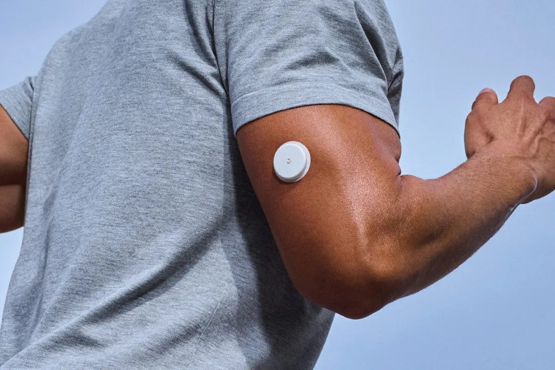
I wore a Continuous Glucose Monitoring (CGM) device for two weeks to see what my blood sugar was actually doing. The data from the Abbott Lingo app sent me down a rabbit hole about metabolic health, and I ended up doing my own data analysis to better understand how my body handles sugar.
For the first five days, I was hyper-aware that my glucose was being tracked. I ate cleaner, exercised more deliberately, and paid attention to my sleep. This mirrors the “Flash Diet” phenomenon where dieters photograph their food before eating. The act of documenting forces mindfulness, making it easier to skip the late-night snack or say no to the second serving.
After day five, the novelty wore off and my habits returned to normal.
What Even is Metabolic Health?
Metabolic health is how well your body turns food into energy without letting blood sugar, cholesterol, or fat storage get out of balance. After you eat, carbohydrates break down into glucose, which enters your bloodstream. Your pancreas responds by releasing insulin, a hormone that acts like a key, unlocking your cells so glucose can enter and be used for energy. When this system works well, blood sugar rises modestly after meals and then returns to baseline. Exercise and stress can also trigger temporary spikes because your liver releases stored glucose to fuel your muscles or prepare for a “fight or flight” response.
A continuous glucose monitor (CGM) is a small sensor inserted under the skin that tracks blood sugar in real time every few minutes. It doesn’t measure insulin directly, but it shows how your body responds throughout the day to meals, workouts, sleep, and stress. This type of device is commonly used by diabetic patients who need to manage their insulin carefully and provides a much more real-time, digital, and safer alternative to the finger-prick machines that have been around for decades.
💎 Mighty Metric: Hemoglobin A1C

An HbA1c blood test measures the percentage of hemoglobin in red blood cells that has sugar attached. Since red blood cells live for about three months, the HbA1c reflects your average blood sugar over that time.

For a healthy adult, an HbA1c below 5.7% is considered normal. From 5.7% to 6.4% puts you in the pre-diabetic range. Anything over 6.5% is diagnosed as diabetes.
Diving into the Data
Now for the interesting part: what my body actually revealed.
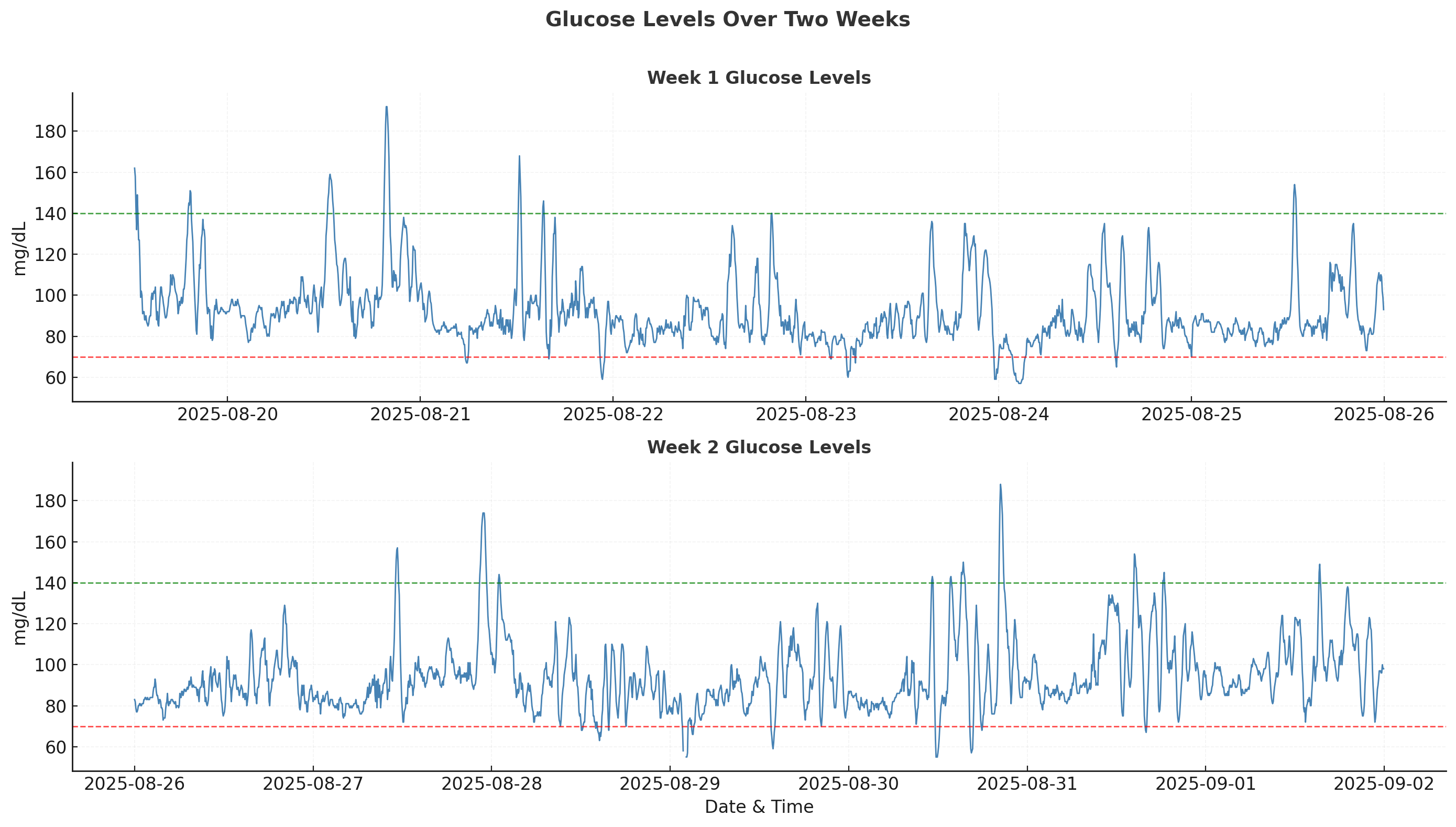
According to clinical guidelines, you should try to keep your glucose within the 70-140 mg/dL range throughout the day (shown as dotted lines in the chart). Excursions outside this zone are normal but should be minimized.
1. Glycemic Variability
My mean glucose over the two weeks was 93.1 mg/dL with a standard deviation (SD) of 16.9 mg/dL. While mean and SD give a basic measure of variability, there’s a better metric for my individual baseline: the Coefficient of Variability (CV).
Coefficient of Variability (CV) = Standard Deviation (SD) / Mean × 100My CV came out to 18.1%. The International consensus on CGM sets CV <36% as the target for stable glucose control. However, research on people with normal glucose metabolism shows reference ranges of SD = 7.9-24.8 mg/dL and CV = 7.74%-22.45% so my numbers fall comfortably within the healthy range.
2. Time in Range Analysis
Time in Range (TIR) is one of the most intuitive and actionable metrics from CGM data. For people without diabetes, the target range is typically 70-140 mg/dL. My results showed 95.6% time in range, 2.1% above range, and 2.3% below range. Large-scale studies show that normoglycemic adults spend about 87% of their time in this range so my tighter control probably reflects the initial mindfulness during the first week of wearing the device.
Dr. Andrew Huberman, in his podcast with Dr. Casey Means, discusses how the goal with CGM use should be keeping glucose within this healthy range as much as possible throughout the day rather than chasing perfectly flat readings. This single metric can have the biggest effect on your overall metabolic health.
3. Mean Amplitude of Glycemic Excursions (MAGE)
MAGE is a more nuanced measure of glycemic variability. Instead of looking at all fluctuations, it focuses on the size of major glucose swings. The metric was introduced by Service et al. in 1970 as a measure of “diabetic instability” and has since become a standard way to quantify how well your body regulates glucose.
MAGE Algorithm

1. Smooth lightly (5-point centered rolling mean) to reduce sensor noise.

2. Find all local maxima/minima via sign changes in the first derivative.

3. Build consecutive peak/nadir pairs (yellow Xs in image)

4. Keep only excursions with amplitude ≥ 1× SD of the whole series (red Xs in image)

5. Calculate the mean amplitude of those kept pairs = MAGE.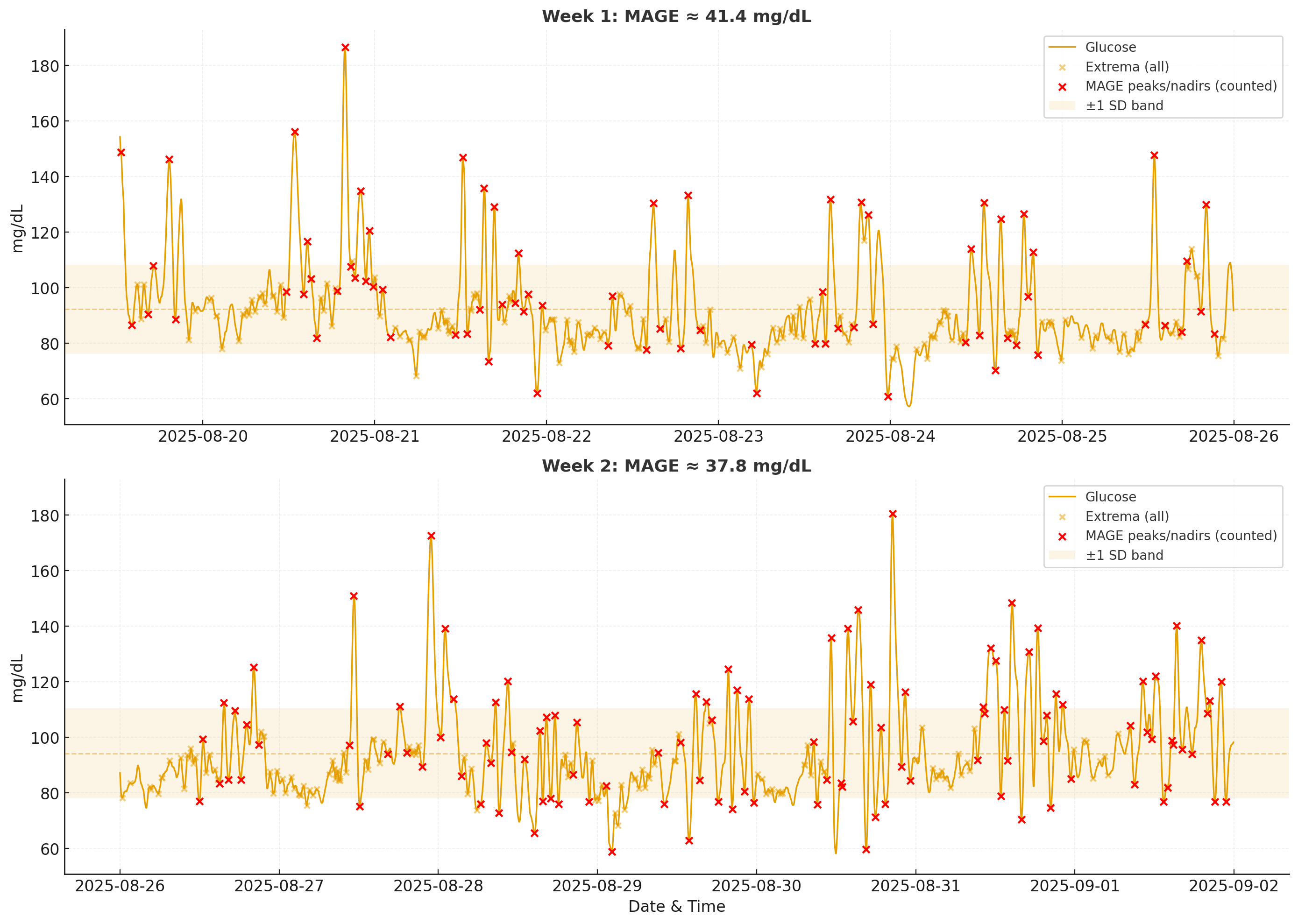
The key insight is that MAGE measures how big your average “big” spike is. This differs from CV or Time in Range because it doesn’t aggregate all readings. According to the literature, MAGE values in patients without diabetes are nearly 30 to 40 mg/dL, while diabetic patients often see values over 60 mg/dL. My MAGE for the two-week period was ~38 mg/dL, placing me at the upper end of the healthy range but well below concerning levels. Higher MAGE suggests the body struggles to return glucose to baseline smoothly, while lower MAGE indicates more effective regulation.
4. Mapping Daily Volatility
Now that I understood my overall performance, I wanted to see if the data captured my day-to-day routine and whether any obvious patterns emerged. I started with a heatmap.
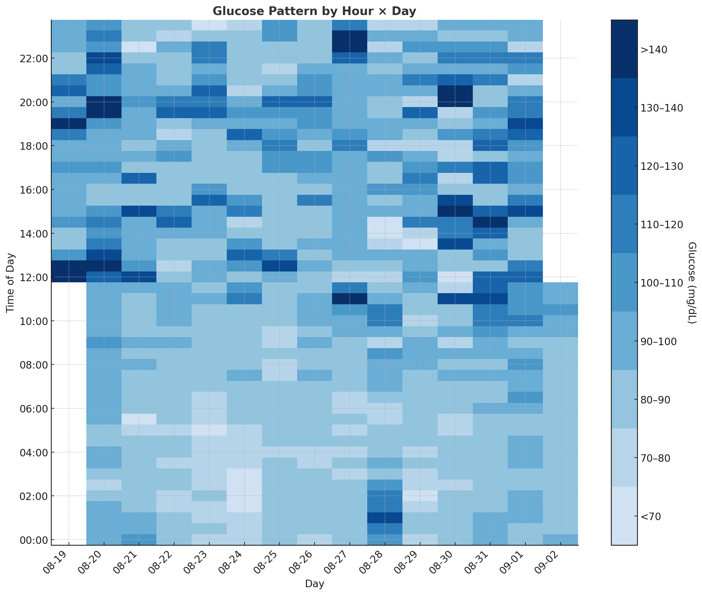
The most obvious finding is that nighttime glucose levels are significantly lower and more stable compared to daytime levels. This aligns with clinical literature and common sense since my body isn’t using much glucose while I’m asleep.
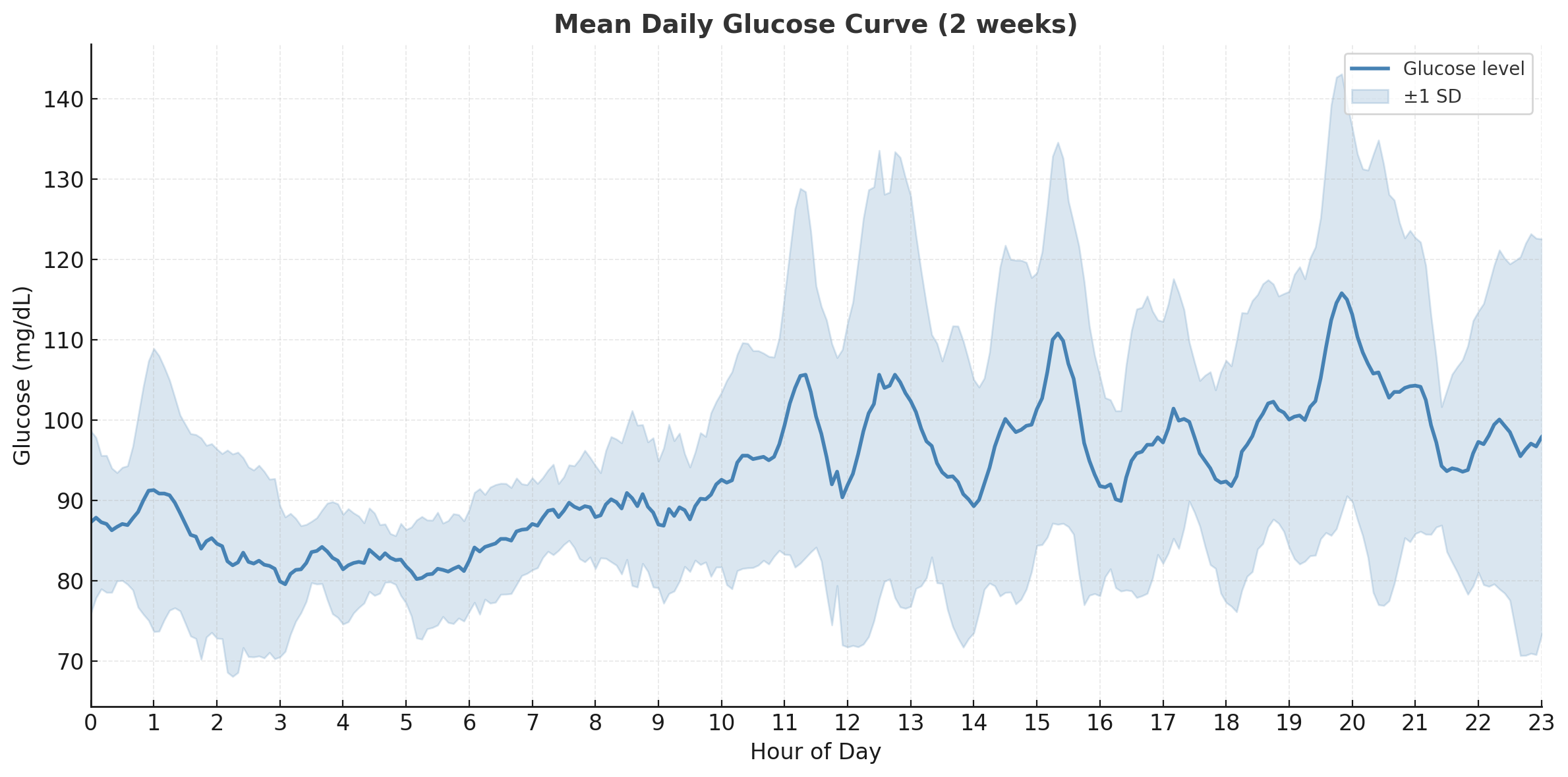
In this plot, I show the average glucose at any given time across the two weeks, along with one standard deviation for variance. The daily pattern becomes clearer- my body keeps fasting glucose consistent within a desirable range of 85-100 mg/dL from midnight to 6am. From 6am to 10am, there’s a slow but very consistent rise without much variation since I don’t eat during this period. From 11am to 9pm, I’m eating meals and exercising, so glucose rises and falls with high variation. The meal times weren’t consistent, nor were the foods I ate, so the high variation makes sense.
5. Chasing the Dawn Effect
One phenomenon I was particularly curious about was the Dawn Effect.
Normally, while you sleep, your body keeps blood sugar steady, which I could see in my data. But just before waking up (around 4–6am), certain hormones like cortisol and growth hormone kick in and tell the liver to release stored sugar into the blood, so you have energy to start the day. This is the Dawn Effect.
I usually wake up around 6am, so I looked at the raw data in the 4-7am window. The rises are there but inconsistent and noisy, making it hard to pinpoint the actual rise or quantify it.
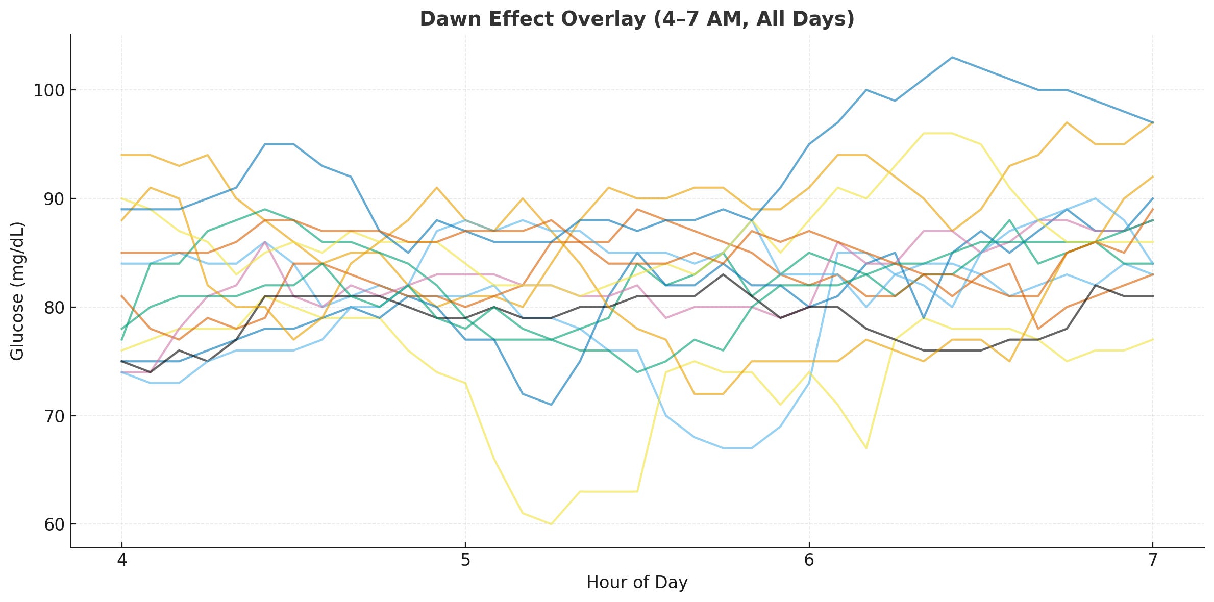
First attempt: too noisy. Since the human body isn’t perfectly calibrated, the timing of the dip and peak don’t align naturally across days. Comparing the delta before and after 6am didn’t show a strong signal. Instead, I anchored each day’s trend line to the minimum glucose value within the pre-wakeup window (3-5am), aligning them at the same relative timestamp.
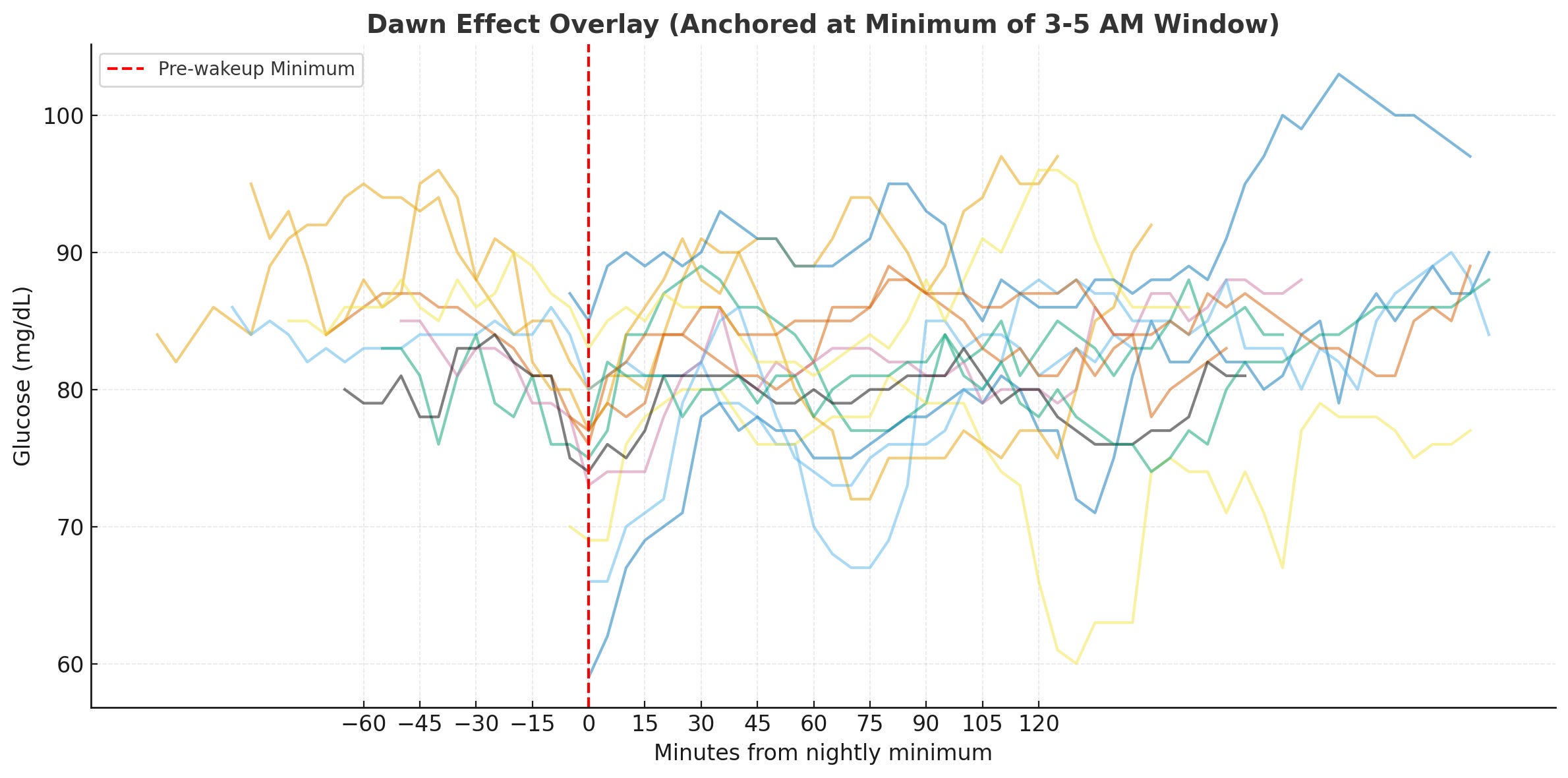
Second attempt: better alignment. The trend became somewhat clearer, so I used mean and standard deviation to aggregate the data and see if there’s a consistent rise from the minimum.
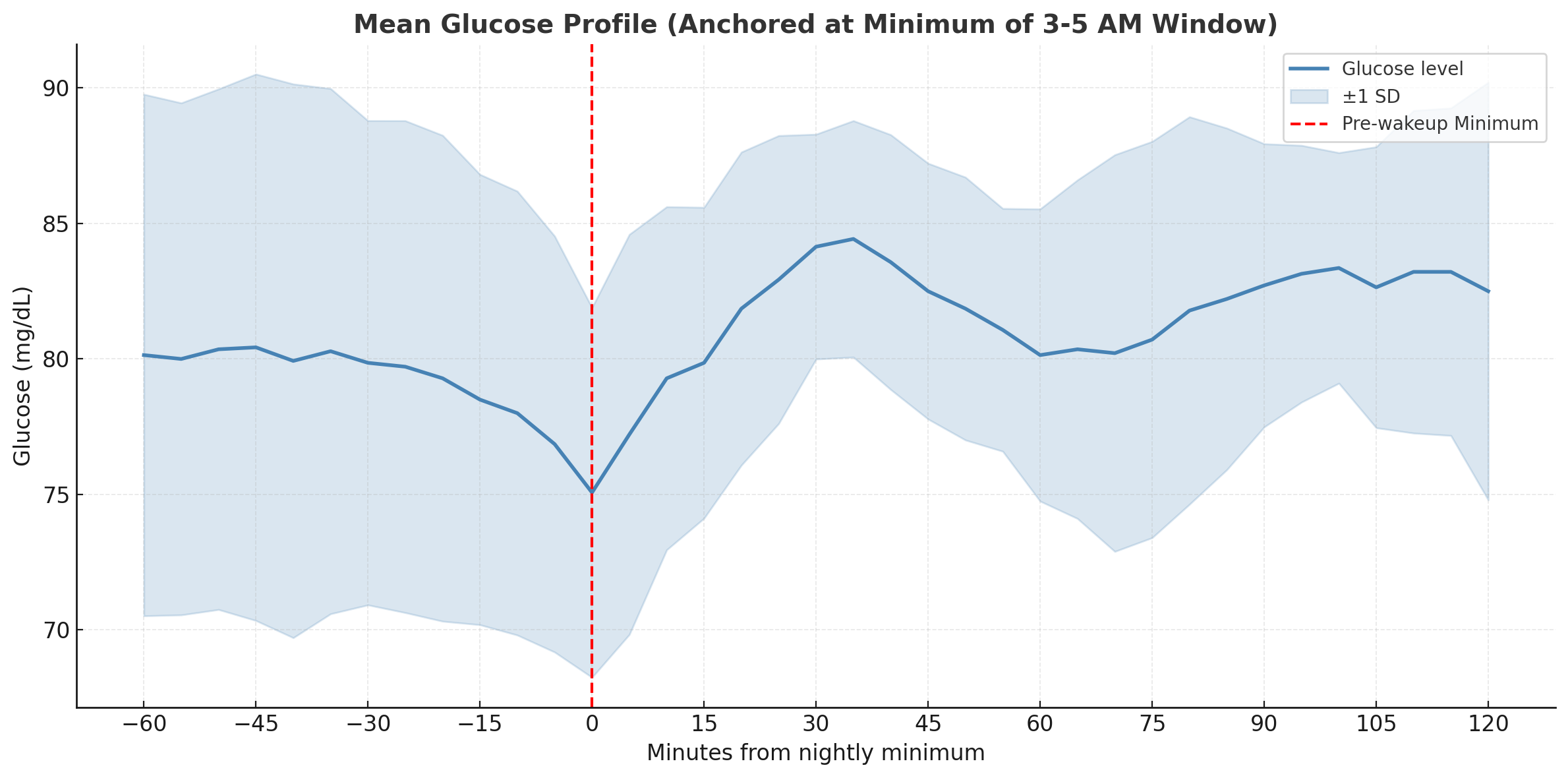
Final result: there it is! There’s a clear upward slope, and the difference from nadir to peak is ~10 mg/dL, which matches what clinical studies suggest for the dawn effect.
The wide variance band reflects normal day-to-day fluctuations rather than measurement error. Studies show median inter-day differences of 15 mg/dL are typical. My 3-5am window for finding the minimum also aligns with the physiology research, as hormones like cortisol and epinephrine surge from nocturnal nadirs between 4:00 and 6:30 a.m.
While the hormonal processes behind the dawn effect occur in most people, healthy individuals compensate with insulin secretion to prevent sustained hyperglycemia. The pronounced effect is primarily seen in diabetic patients and my mild rise followed by stabilization suggests normal metabolic function.
Conclusion
Overall, CGMs are an excellent tool for finding problems in your diet and fixing them proactively. During my two-week experiment, I noticed that red grapes caused a much larger spike compared to blueberries or blackberries despite the published Glycemic Index (GI) data. This highlights why individual testing matters more than population averages.
🍇 Key Takeaway

Red grapes (GI: 43-59) and blueberries (GI: 53) should theoretically cause similar spikes, but my body responded very differently to red grapes with much larger relative spikes in blood glucose.
What interests me is the broader potential of this technology at scale.
CGM companies like Dexcom and Abbott publish studies showing how device features correlate with improved A1C levels and time-in-range metrics. Wellness companies like Oura and WHOOP have demonstrated early illness detection capabilities, identifying COVID-19 infections up to 2.5 days before symptom onset through continuous biometric monitoring. The future of personalized medicine lies not only in aggregating population health data for trends but in learning from millions of individuals at scale, then applying those insights to optimize interventions for each person.
This is something I’ve seen in action with Epic’s Cosmos. Their “Best Care Choices For My Patient” tool allows physicians to see how similar patients responded to specific treatments. For instance, when treating a newly diagnosed hypertension patient, a doctor can view real-world outcomes from the 274 million patient dataset based on age, comorbidities, and previous treatments, rather than relying solely on general guidelines.
Until that future arrives at scale, if you’re interested in an in-depth analysis of your own CGM data, reach out and I’ll show you how to better understand your numbers and optimize your health.